
Click Travel has been disrupting an area once dominated by individual travel managers. Click’s SAAS business travel product allows users to browse, book and manage their bookings themselves.
The Head of Product and Engineering brought me on board to deliver new features, solve more gnarly UX problems, improve their UI and develop their style guide. The focus of this case study is the evolution of the design system.
The Core Team
- Head of Product and Engineering
- Product Owners (5)
- Engineering Team Leads (7)
- Full stack engineers (30)
- UX/UI Designer (me)
My process
Overview
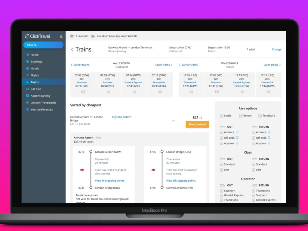
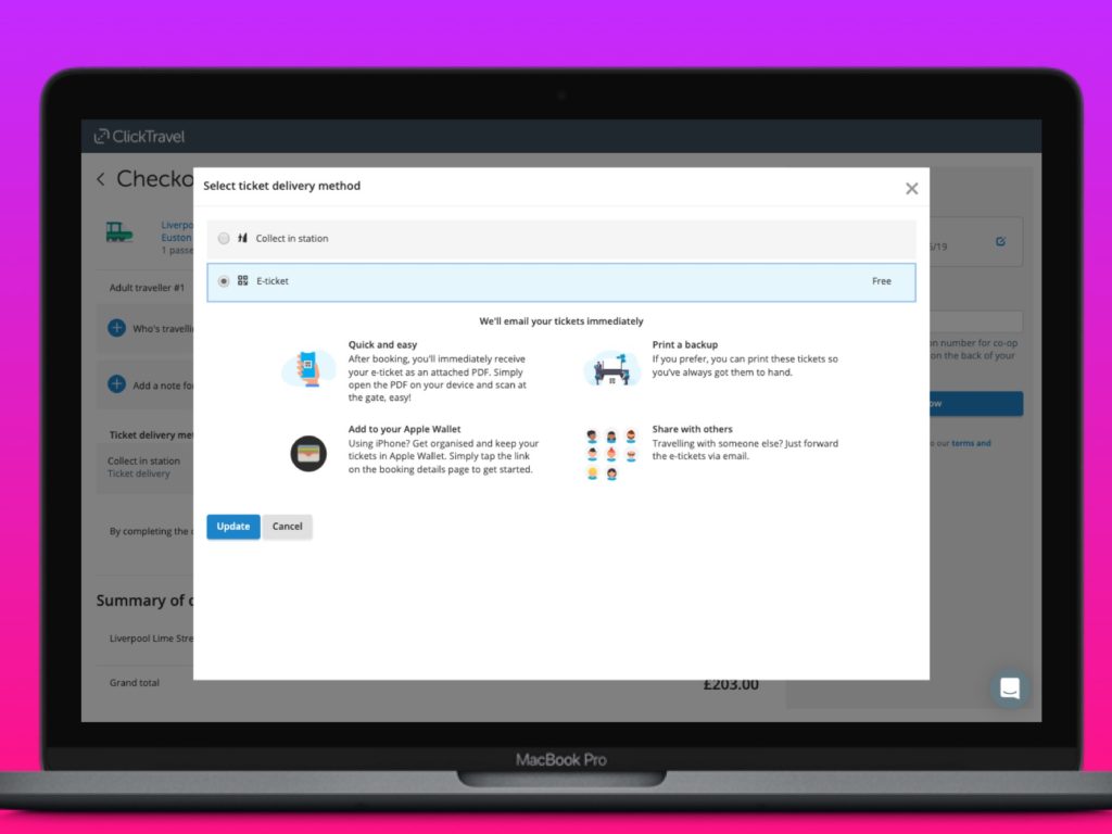
Click were building out features for their new platform ready to migrate their customer base. The platform used the latest tech and thinking to maximise efficiency, speed, scalability and reliability. But it looked like a product that had been designed by Engineers, because—well, it had. UI basics like typography, colour and spacing were all over the place leading to a feeling of discomfort and clunkiness for the end user.
Usability research
Whilst there were clearly some quick wins with the UI it was important for me to understand how real customers found using the product. In my first few weeks I organised some field research with one of their larger and more vocal clients. I spent the day with their key users and ran a set of moderated user testing sessions.
The research exposed a number of weaknesses in the current product areas. The biggest being the train search UX. With all research I shared and presented and shared as widely as possible. Issues are plotted on an Impact /Frequency Matrix which prioritised issues from Low to Critical.
The user research regarding the UI as a while seemed to suggest that it didn’t create any direct usability issues, although a number of smaller but critical issues were picked up around consistency in navigating backwards and forwards in search results.

Qualitatively we were also getting feedback from customers using the new system – in the form of NPS scores. I spent some time analysing the NPS feedback and found that we were frequently getting comments using the keyphrase ‘clunky’. Whilst these customers were clearly dis-satisfied, there was no clear usability problem they had encountered.
The Aesthetic/Usability Effect was coming into play with our customers perceived ease of use.
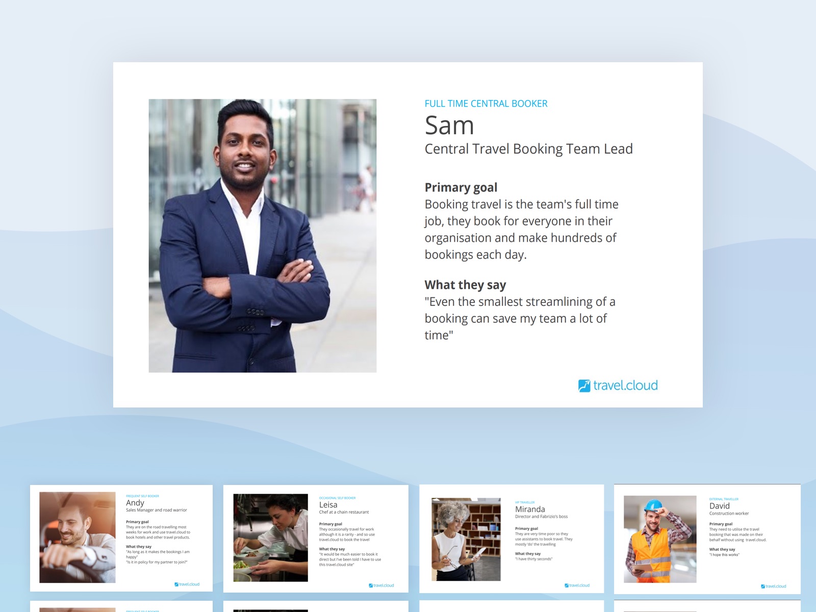
Understanding our customers
To understand our users a little better I organised an empathy mapping sessions with stakeholders. We identified 11 different customer profiles through these sessions (4 key customers) – its a complex product!

Through the sessions I was able to flesh these out into user personas which we were able to use for all future product development work.
Establishing the pattern library
The engineers had created a semi living style guide but there were no design assets. I quickly sought to understand how to use/edit and update the html style guide and set to work recreating the components we had in a Figma pattern library.
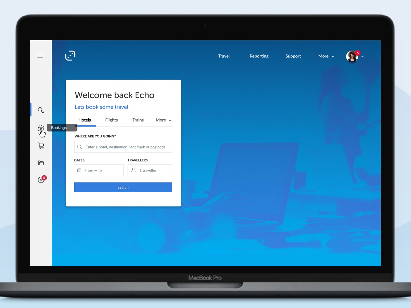
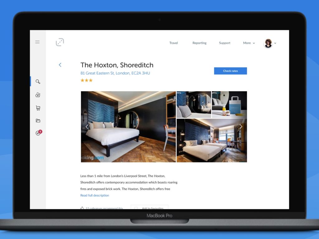
Providing a vision for the future
So that we could get an idea of where we wanted to get to I worked with a small team of senior stakeholders and PMs to product a set of screens – which could highlight where we want to take the product in the future, both from a UX point of view and also a UI point of view.


Prioritising changes
As a single designer – and without a dedicated team we weren’t going to radically overhaul the UI overnight. The engineering team were busy shipping features, and they needed my support for that too. This may not have been such a bad thing because users dislike change. Instead I planned to make small incremental improvements to the UI, improving over time.
I created a Trello board with potential changes/improvements and rates each based on a combination of Impact, effort and confidence. Those with the highest score were tackled first. I invited engineers and Product Managers to feed into this list too.
Evolving the pattern library
As the incremental improvements were made so the pattern library and Figma component library were updated an evolved.


Outcomes
We saw that comments around clunkiness disappeared – giving confidence that we had addressed the Aesthetic Usability effect issue we were previously seeing
During the time the incremental improvements were made we saw a three fold NPS increase for platform users.
Learnings
Having a style guide codebase separate to the main codebase ensures a safe sandbox environment but causes lots of synchronisation issues. We could have save a lot of time by addressing this.
Whilst we couldn’t address some of the more systemic design problems the incremental approach did provide great design value and with very little pushback or resentment from users but it would have been great to have pushed it further.
Using Bootstrap really did limit us design wise – particularly the 12 column setup.